Date: December 11, 2024
Minimalist packaging: elegance and colors
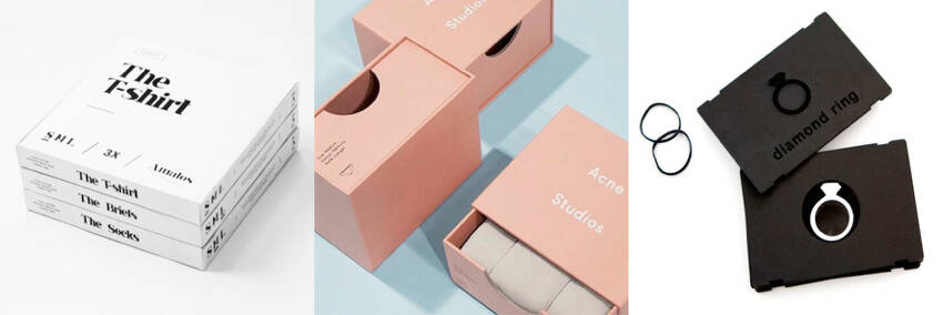
The idea that packaging needs to be filled with a multitude of information and icons is outdated.
Today, for more style, transparency, and readability, the trend leans toward simplified packaging.
A legible typography, a few touches of color or a solid background, a pictogram, the necessary information, and legal mentions are all it takes. The result? Your packaging stands out with elegant simplicity!

Sources Pinterest
This minimalism and the sparing use of colors serve two purposes. First, it gives consumers a sense of transparency, proof that there is nothing to hide by overloading the design to distract from certain details.
As transparency becomes increasingly valued by a growing number of consumers, packaging becomes the first and best messenger to convey the product and brand image.
When unnecessary elements are removed, the focus shifts to essentials. This leads to the second principle: everything is streamlined for optimal readability.
Typography and colors take center stage, becoming key distinguishing features between one packaging design and another.
In minimalist packaging, these two elements have a strong identity that creates harmony and balance in the design, aligning with broader trends of simplicity found in other art forms: architecture, visual arts, photography, decoration, etc.
Moreover, the international marketing of products also supports this minimalist trend: many regions worldwide have a culture of simplicity and a preference for clean designs, such as Scandinavian cold style or Japanese Zen, which have topped design trends for many years!

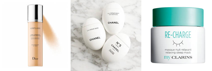
Sources Pinterest
Monochrome or dual-tone gradients are the limit for achieving a minimalist design. Sometimes, even a transparent container, where the product itself provides the color (especially for beverages), is preferred.
These colors are often framed in curved lines or geometric shapes to make them stand out, typically paired with black or white for contrast.
As for typography, all styles are possible. However, to maintain the minimalist experience, highly readable sans-serif fonts are most commonly used.
If needed, brand designers may enhance the design with illustrations, but not just any—pictograms remain the best solution to express the product’s content!
Combining a limited color palette, minimal written information in a clear font, and simple pictograms creates an elegant and refined whole, standing out from competitors and embodying the mantra “Less Is More.”
And while this type of packaging is often used for high-end products, there’s nothing stopping mainstream brands from embracing the trend!

Sources Pinterest
P.S.: Find more tips and trends on packaging design on the Packtory® blog!


